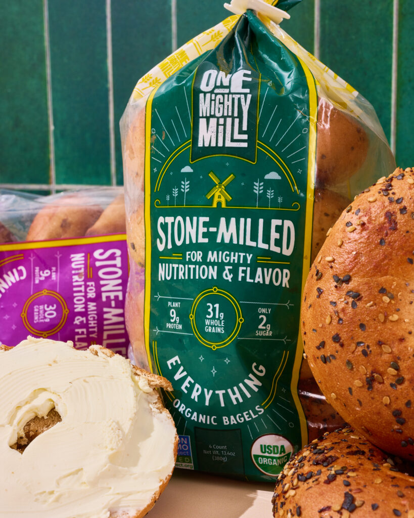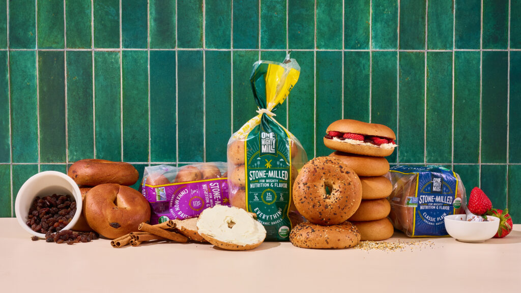
One Mighty Mill is known for stone-milling their flour the old-school way—and we were hired to create visuals to honor that process while showing how their breads fit beautifully into everyday life.
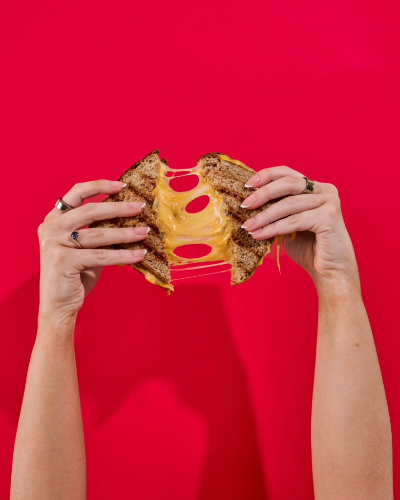
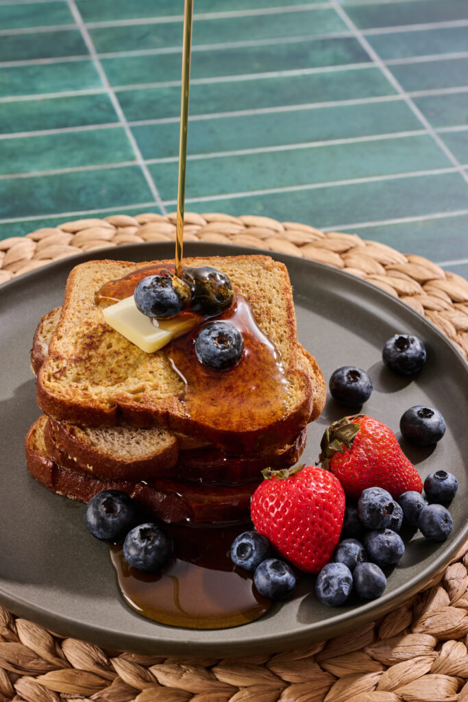
The goal? Create a horizontal, website-ready content library that feels abundant, craveable, and endlessly usable. Golden toast stacks. Jam swoops. Sandwich pulls. Soft crumb close-ups. Every image designed to make you want to reach through the screen.
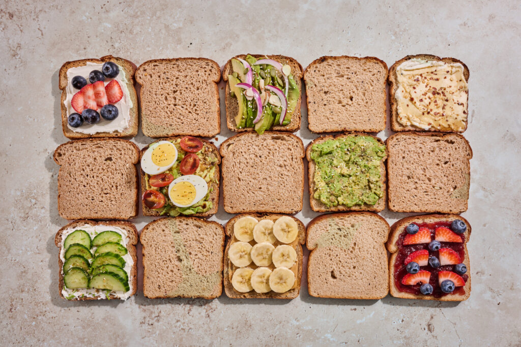
Every cut, smear, and sprinkle was intentional. Because when your differentiator is quality ingredients and traditional milling, the details matter!
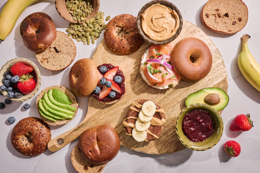
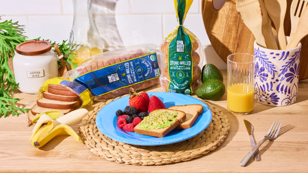
We created a range of elevated-but-attainable use cases:
- Morning avocado toast with flaky salt
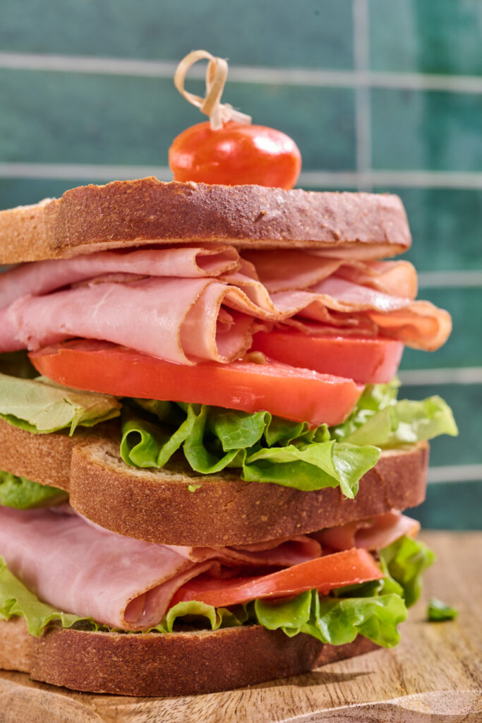
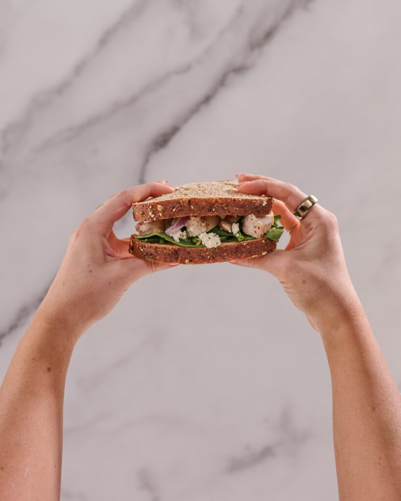
- Overstuffed deli sandwiches with layered texture
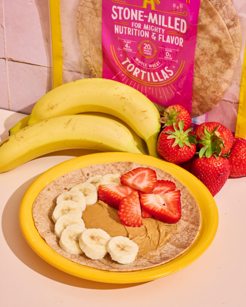
- Classic PB&J with a nostalgic twist
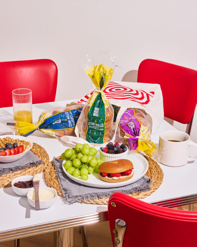
- Breakfast table spreads with jams, eggs, and coffee
Each scene was styled to feel warm, inviting, and slightly aspirational—like your kitchen on its best day.
This entire library was composed intentionally in horizontal format.
Why? Because website banners, Shopify headers, email graphics, paid ads, and LinkedIn placements all crave width.
We built breathing room into every composition—negative space for copy overlays, safe zones for cropping, and consistent lighting for seamless grid layouts.