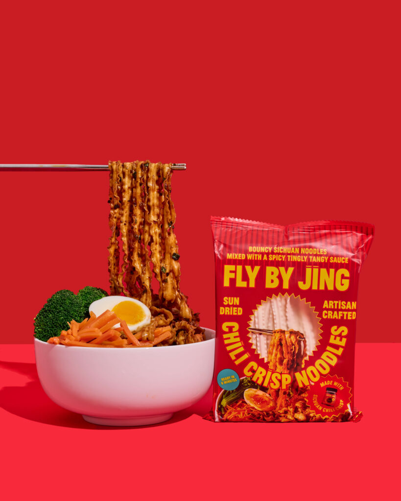
Bold Photos for Bold Flavor: Our Shoot for Fly By Jing
When a brand is known for unapologetic heat, rich umami, and cult-favorite sauces, the visuals can’t whisper, they have to shout! Our goal for Fly By Jing’s shoot was simple: Create imagery that hits like their first bite. Vibrant. Textural. Addictive. Big flavor deserves big visuals! We layered sauce generously so it clung to every …
Bold Photos for Bold Flavor: Our Shoot for Fly By Jing Read More »