When Kewe Energy came to us with a lineup of bold, better-for-you energy drinks, the brief was simple: match the flavor intensity and the can design — and then push it further.
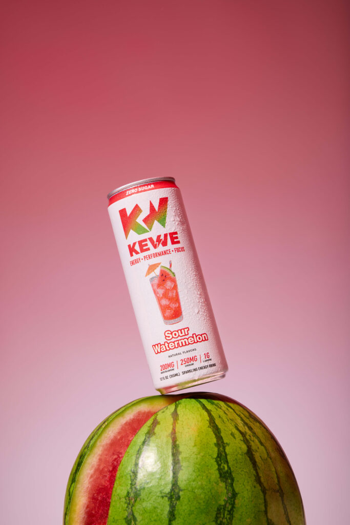
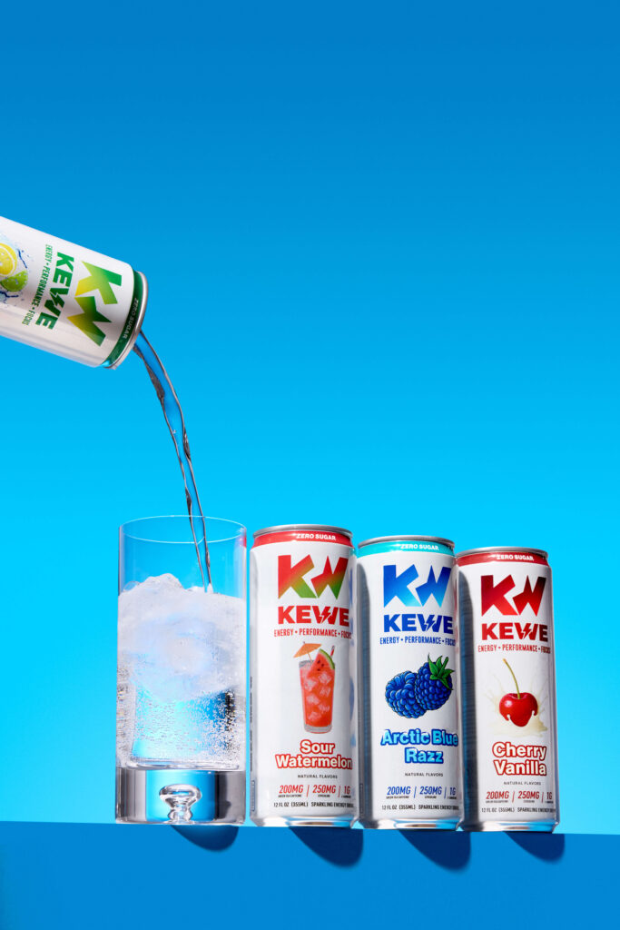
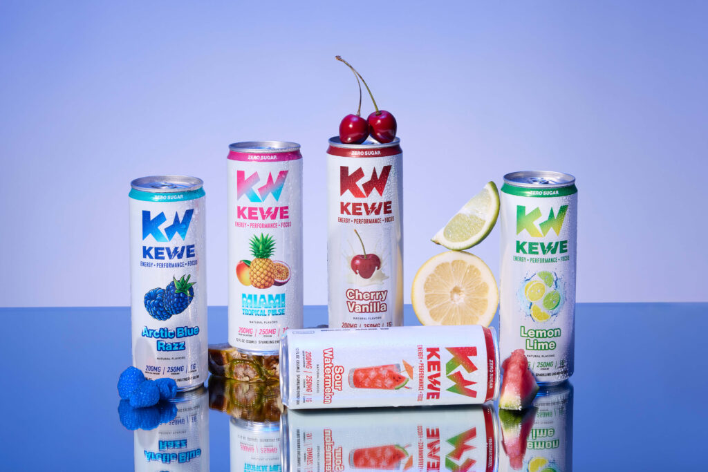
Kewe already had strong visual cues built into their packaging. Gradients. Saturation. Punchy colors. We built custom gradient backdrops that mirrored the cans — colors melting into each other behind the product so everything felt immersive and electric. Not just a can sitting on a surface, but a full flavor world.
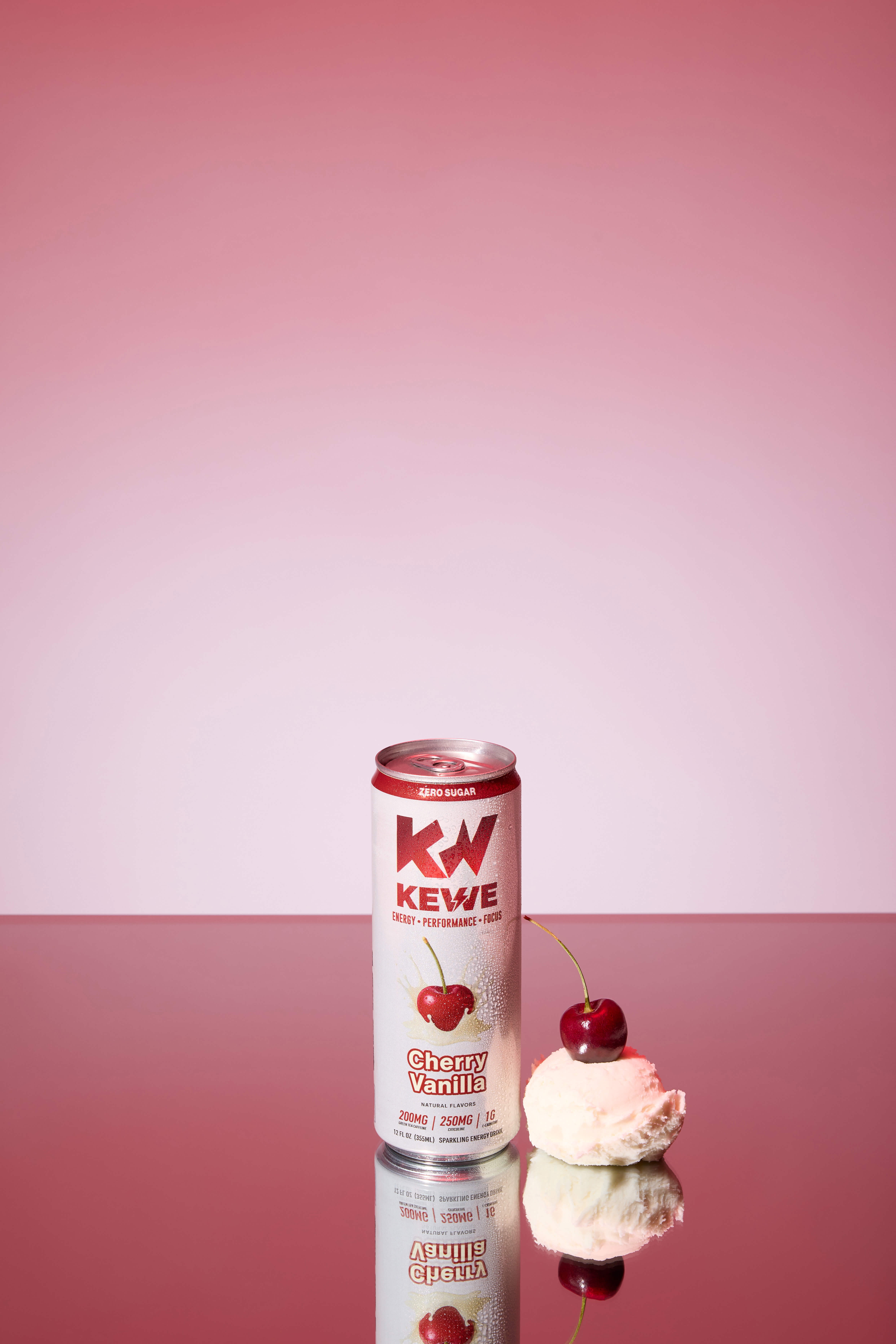
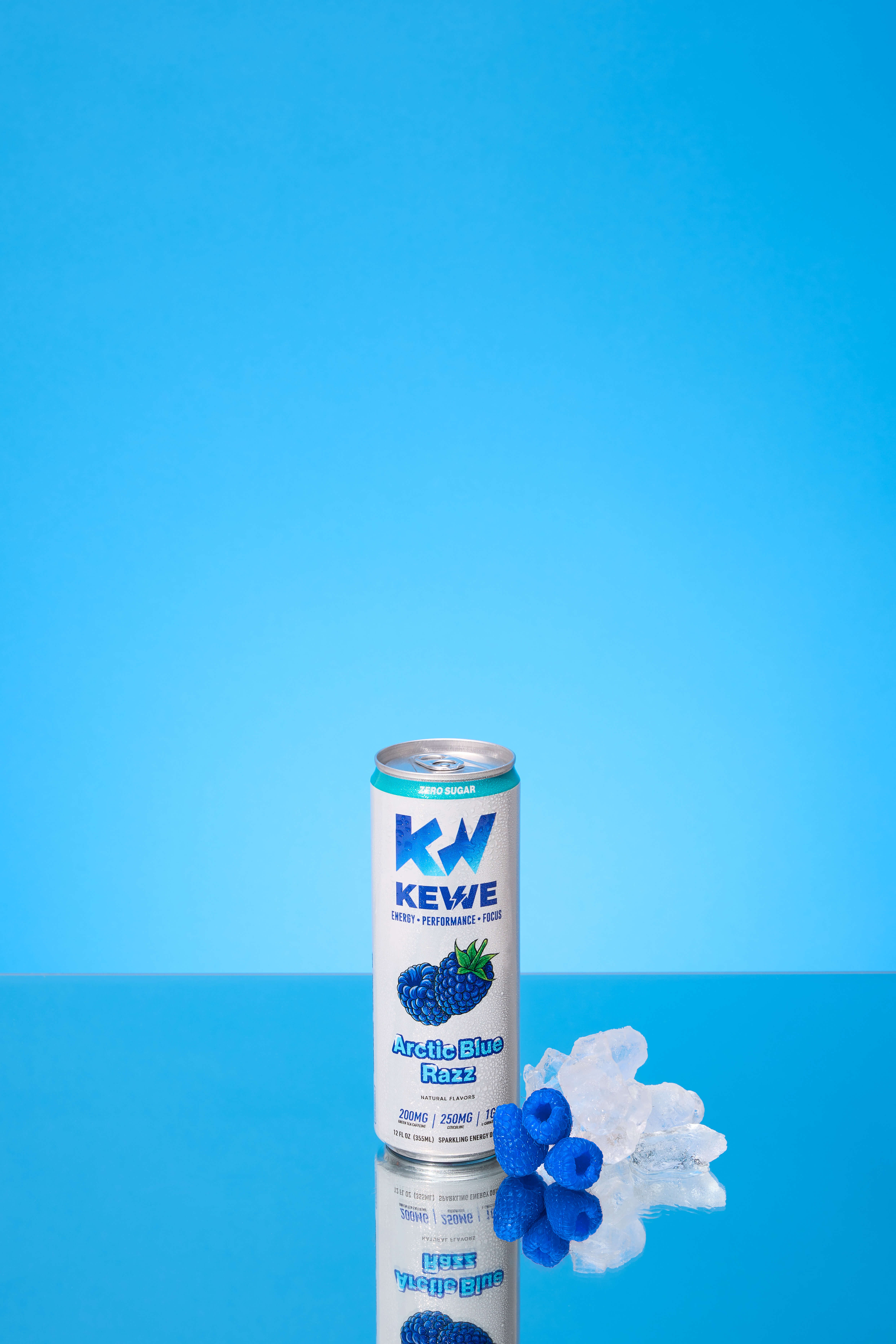
For each flavor, we styled with real fruit to amplify the taste cues — citrus slices mid-air, berries scattered with intention, color-on-color compositions that felt juicy and graphic at the same time.
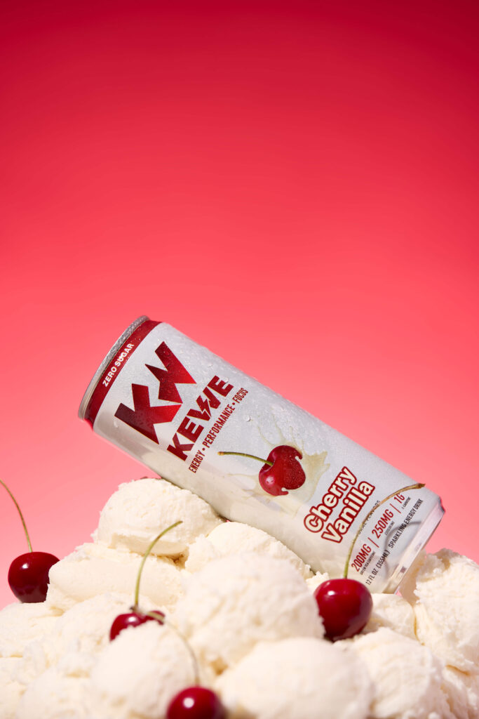
Cherry Vanilla deserved its own moment, so we created an epic mound of fake ice cream to bring the flavor to life in a way that felt nostalgic and over-the-top. Think soda shop energy meets modern performance drink. The can nestled into swirls of glossy “ice cream,” condensation dripping, color popping everywhere.
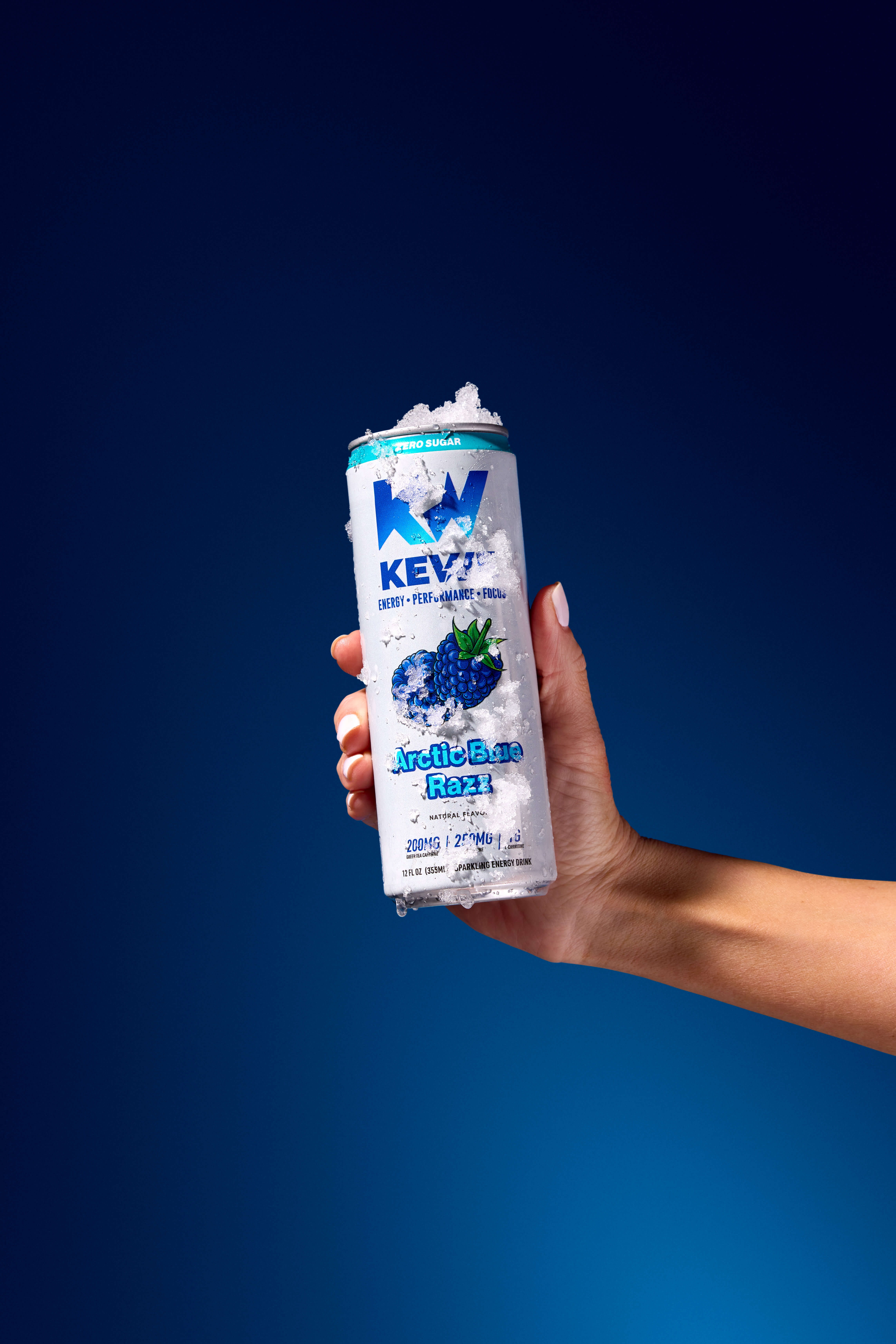
Then there was Arctic Blue Razz.
We used real snow.
Cold, textured, slightly chaotic snow to build an icy environment that made the can feel frozen in time. Crisp blues. Sharp highlights. Breath-in-the-air kind of visuals. It instantly communicated flavor without needing a single word.
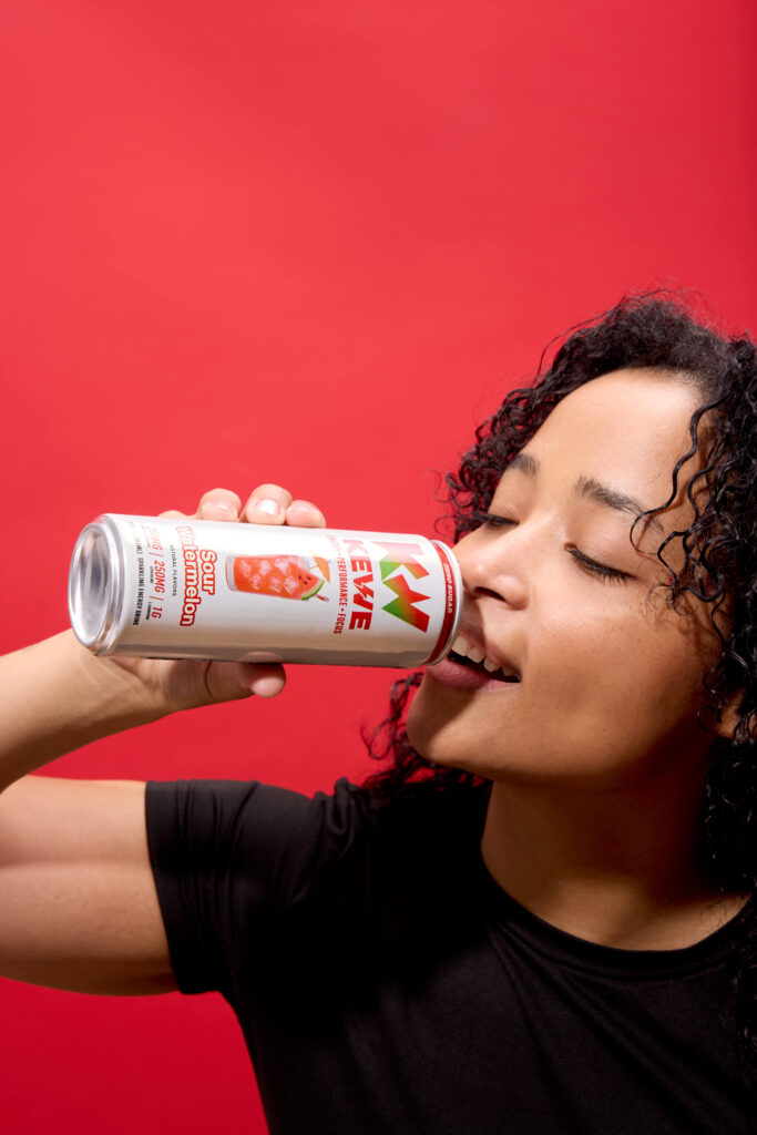
The whole shoot was playful but intentional. Graphic but dimensional. Clean enough for PDP and retail decks, bold enough for paid and social.
Kewe isn’t trying to be subtle. It’s an energy drink that knows exactly what it is.
So we built a visual world that does the same.