When Pinkie came to us for their tampon launch, the mission was clear: make period care feel modern, confident, and completely unawkward.
No clinical vibes. No outdated “blue liquid” energy. Just a brand that understands its audience — and shows up for them visually.
We handled the full content build from the ground up.
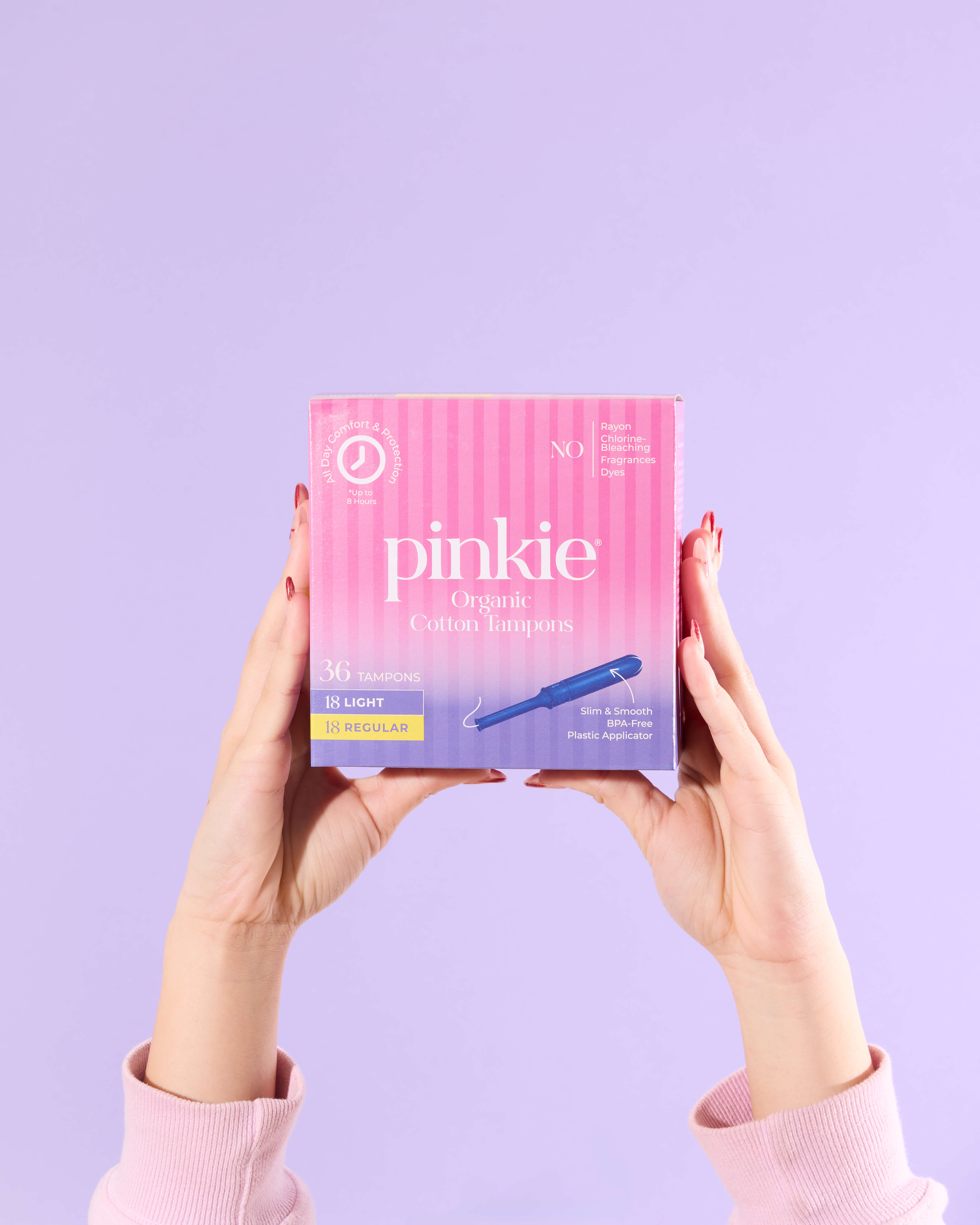
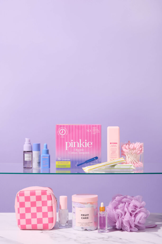
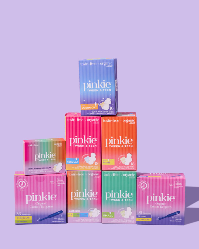
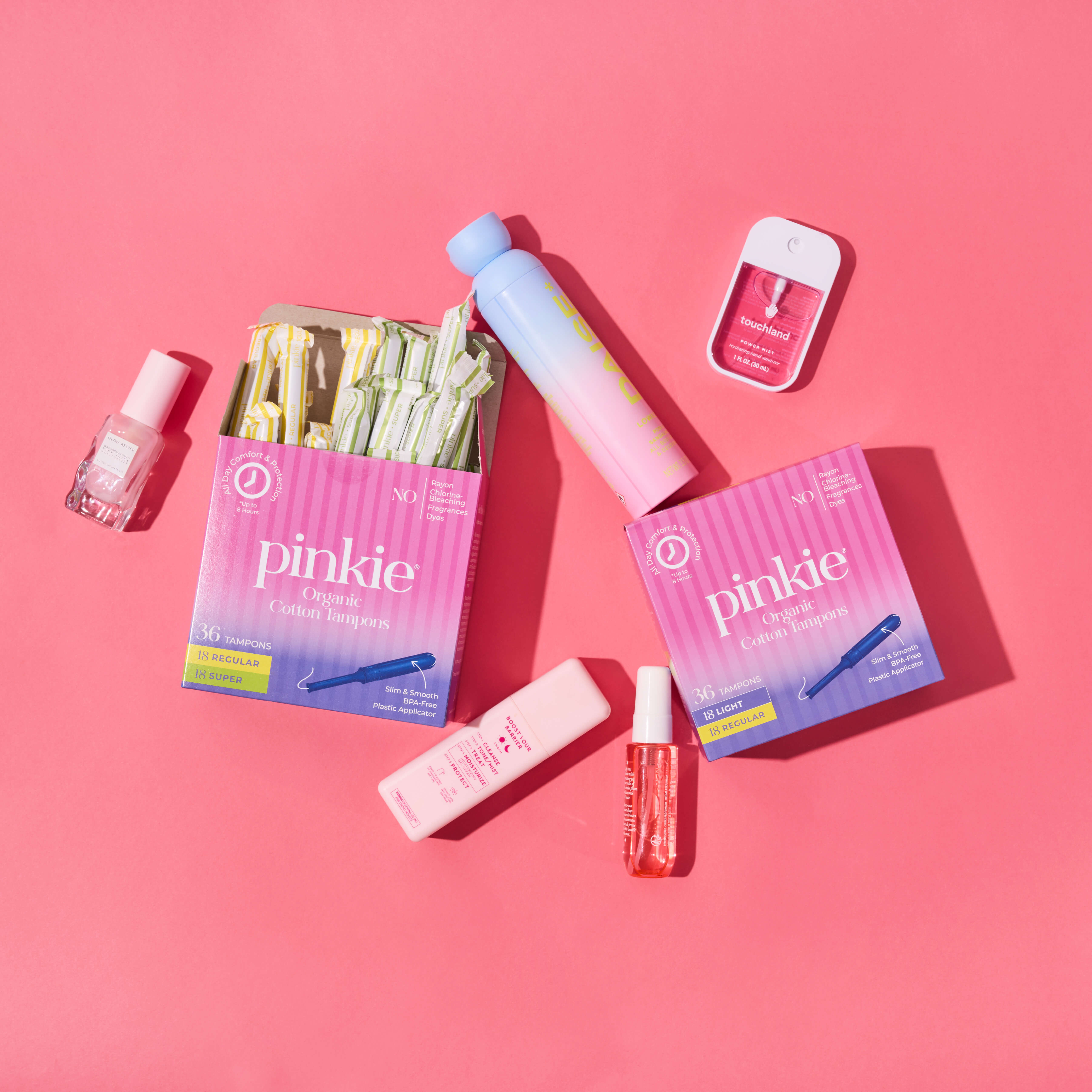
First: retail-ready Product Detail Page imagery. Clean studio shots that clearly showcased the tampons, applicators, packaging details, and absorbency options. Crisp lighting. True-to-color tones. Close-ups that answer questions before a shopper even has to ask.
But PDP content alone doesn’t build connection.
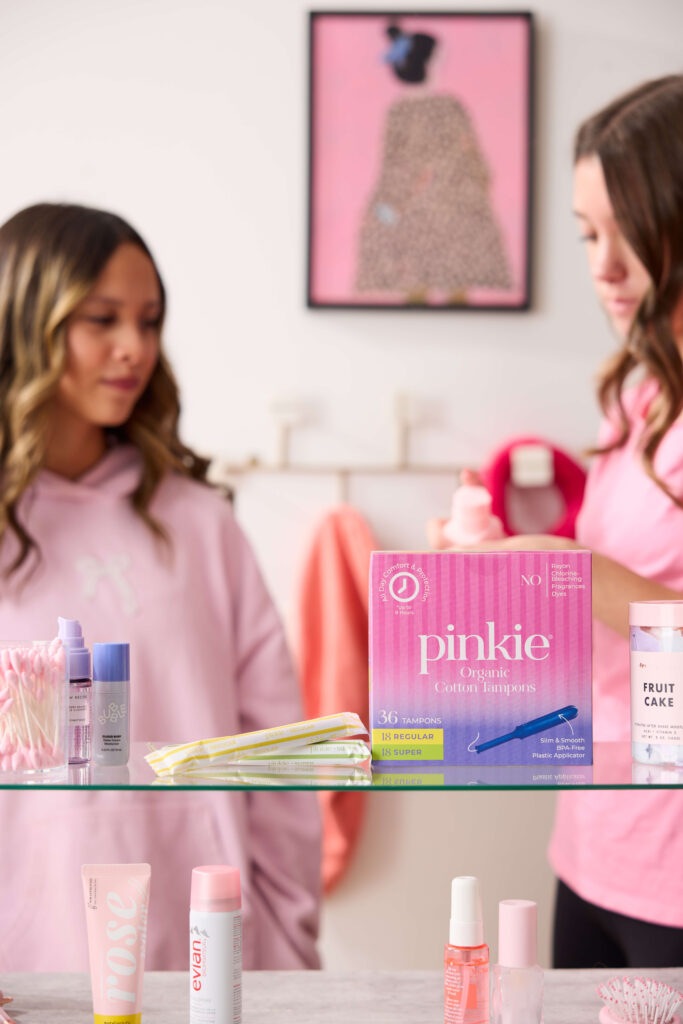
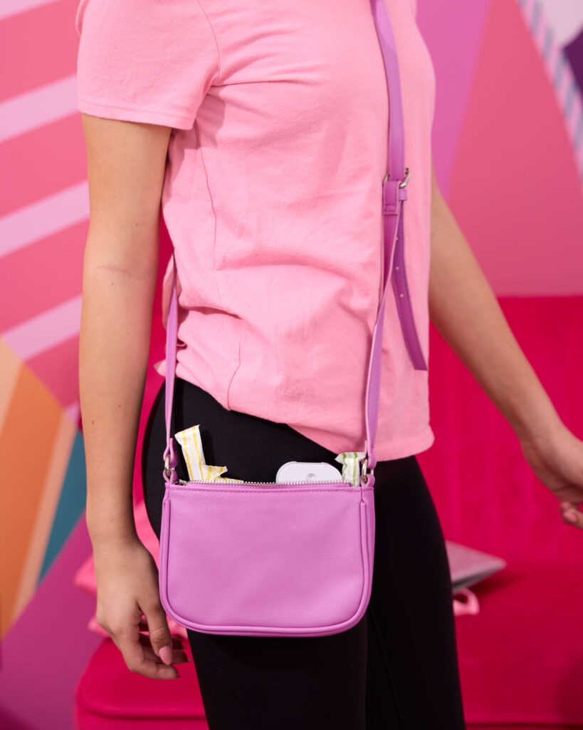
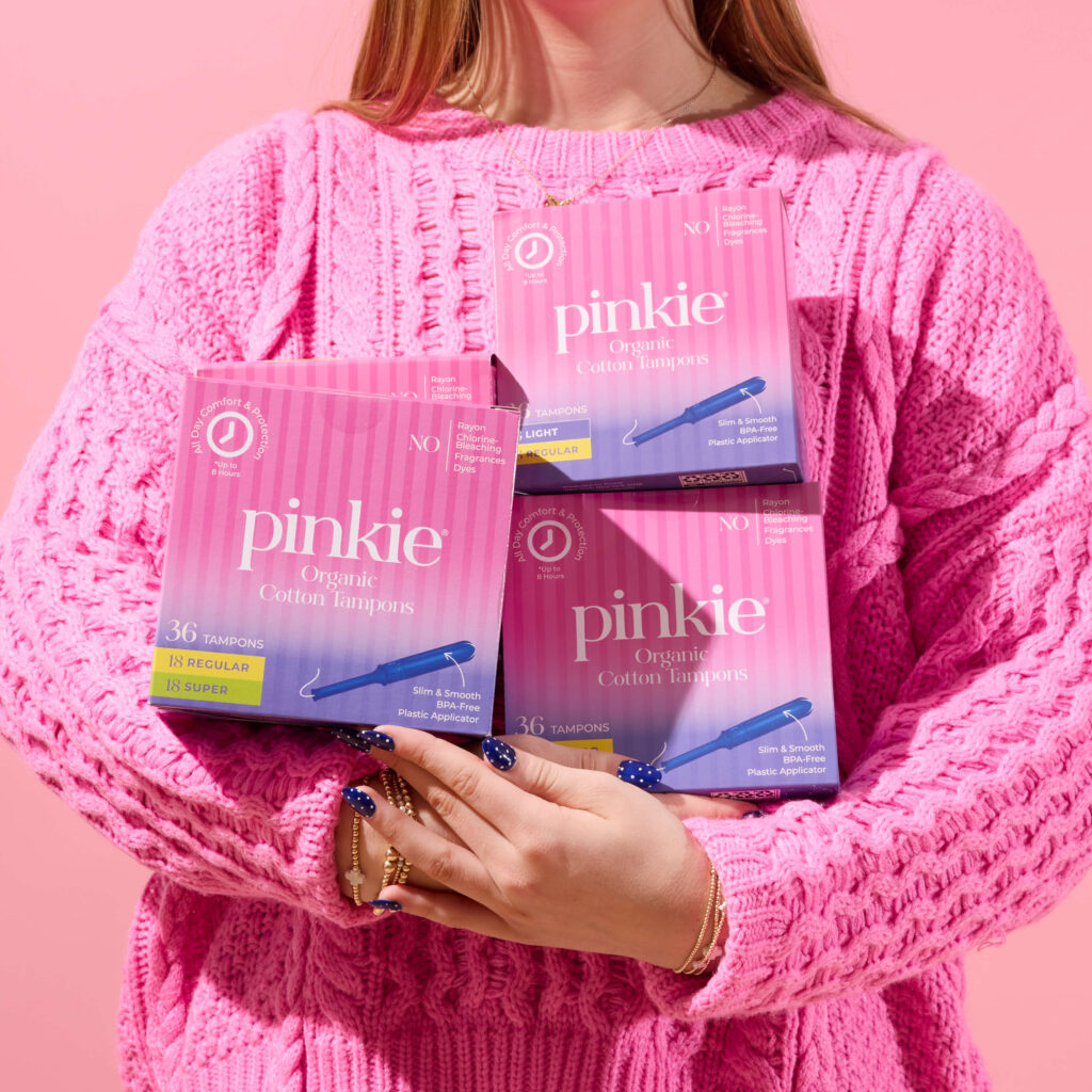
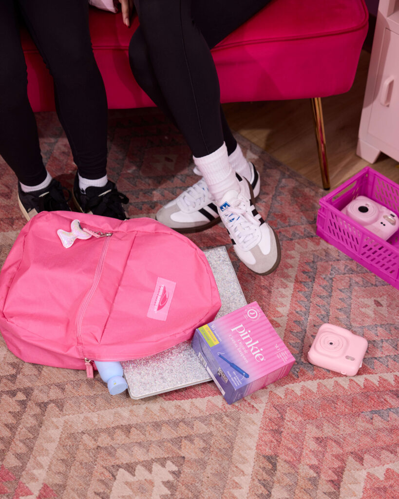
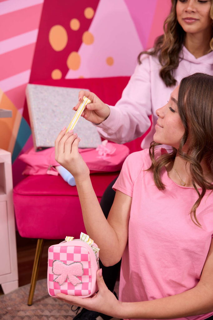
So we layered in lifestyle.
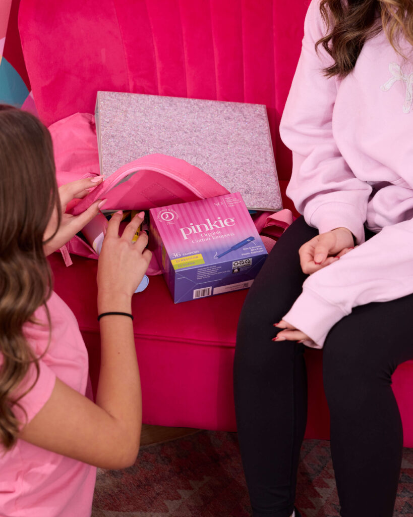
We scouted an incredible group of teens and built out on-brand settings that felt real — bedrooms with personality, getting-ready moments, tossing a product into a backpack before school, hanging out with friends. Everything styled intentionally, but never overly polished. The goal was confidence, not perfection.We focused on body language that felt natural. Expressions that felt genuine. Spaces that looked like actual teen environments/ Because this isn’t just a product. It’s a first-experience category for many of their customers and the visuals needed to feel safe, relatable, and empowering.

The final library gives Pinkie everything they need for launch and beyond: high-converting retail assets, scroll-stopping social content, and lifestyle imagery that reflects their real audience.